You Can (and Should) Judge a Book by Its Cover
Your book cover is one of the most important elements of your book. Think of it in terms of your business: if you own a car dealership, you need a sign out front. If you don’t have one or it’s broken, chances are, people will drive right by. Your book cover is prime real estate!
And by that, I mean that there are five specific locations that you want to maximize when creating and publishing a book. In real estate, you may have heard investors or real estate professionals say, “location, location, location!” That means that no matter what home or property you choose to invest in, it’s all about location. Choosing the most beautiful home in a rundown neighborhood will result in you losing your investment.
Location is everything!
On a book, there are five locations of real estate that are critical to selling and marketing books even before someone opens it up to read.
You know the old saying, “you can’t judge a book by its cover?” Well, you actually can and should! If the cover is bad, that means the book is probably bad, too. You don’t want something that’s poor quality or confusing. If the cover isn’t clear, if it doesn’t grab me, if it’s not overflowing with hope and the promise of what I will learn, then the inside isn’t going to be any better. You actually can judge a book by its cover. In fact, publishing experts like ourselves will tell you that book sales are 90% determined by the cover. That’s the sale.

So, the first piece of real estate is your front cover. If you compare it to a house, the front cover is actually what real estate agents call curb appeal. It has to be welcoming, it has to be bright or eye-catching or fit the audience. It has to have all of those elements, not just one. The cover title has to provide clarity and the subtitle cannot be confusing. You must tell your reader what they will learn or what they will find inside. When it comes to title and subtitle, we got you. This is our expertise at OnFire Books.
We help others navigate titles and subtitles that draw in readers and sell millions of books.
So, the first area of real estate on a book is the front cover. The second is the back cover, the third is the inside flaps copy (if you have a hardback with a dust jacket), the fourth is the introduction and the fifth is the content itself. Notice that the front cover comes first because there is a precise order to this.
I prefer doing the front cover early on. Creating a vision for the author helps them to achieve two things:
The cover is something that you can put on your website and start accepting pre-orders on right away. Celia Swanson, who we wrote the book Gracious and Strong for, was a Walmart executive who reported to the CEO. She was the first female Executive VP. Here is her book cover below. It’s one of my favorite covers.
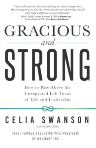
I happen to like this book cover because it’s clean, bright, and catches your eye. While you can do anything you want on your book cover, don’t forget the number one rule which is to offer clarity. You have to make sure that you offer clarity at a glance. In today’s world, what does that mean? It means that you must be able to read the cover online, on your phone, standing in the sun, or on a train, or riding a bike, or the other multitude of ways that the audience and consumer views things today. Some people don’t even own a computer and do everything on their cell phone. 90% of all the covers will be reviewed on mobile so you have to make sure that your cover is clean and crisp and mobile friendly.

When it comes to colors, this is the time to go deep within and search your heart. Now is the time to eliminate any colors that you don’t love. It doesn’t matter what the experts say at this point because it’s your book, it’s your cover, and ultimately this is something that once we create this for you, and with you, it’s going to last for decades. I’m still getting calls to be on shows on books that I wrote over a decade ago.
I give our TEDx candidates the same advice when it comes to preparing themselves to deliver a TEDx talk. What you wear actually does matter and it must be timeless. When I first auditioned for TEDx, one of the first things the organizers told me in Dallas was don’t wear black.
Well, if you review my TEDx link below, you’ll see that as usual, I ignored their advice.
I had watched over 100 Ted X talks and I knew that black is timeless. I wore black. If I would have worn the blazer that was in fashion then, but chances are it wouldn’t be in style a decade from now.

Watch Tammy Kling’s TEDx Talk, “Words are Currency:” http://m.youtube.com/watch?v=bA2rTnpAF44
Make your book cover beautifully timeless.
This is your book, look inside your soul and think about the design elements that you really like. Your picture should go on the back and we will help you design the cover copy.
If you haven’t collaborated yet on your book cover design, let’s do this together. Stay focused and take a trip to the bookstore on a date with the one you love or even better perhaps, a date with yourself to have coffee, or hot cocoa, and pick out five books that you are absolutely in love with at first sight.
Love at first sight does exist and you can judge a book by its cover! Your cover matters.
– Tammy Kling CEO of OnFire Books